

AT HOUSE STARK WINTER WASN'T ALWAYS COMING.
The Targaryen conquest stripped House Stark of their “King of the North” title and demanded a serious rebranding, including a unified multi-channel brand look. As one of the oldest brands in Westeros, The Starks had a strong, well-liked reputation among vassal houses. But, among the design community, they had a reputation for having strong, aggressive opinions. As we helped House Stark learn, just because you’re good at battle doesn’t mean you’re good at branding.
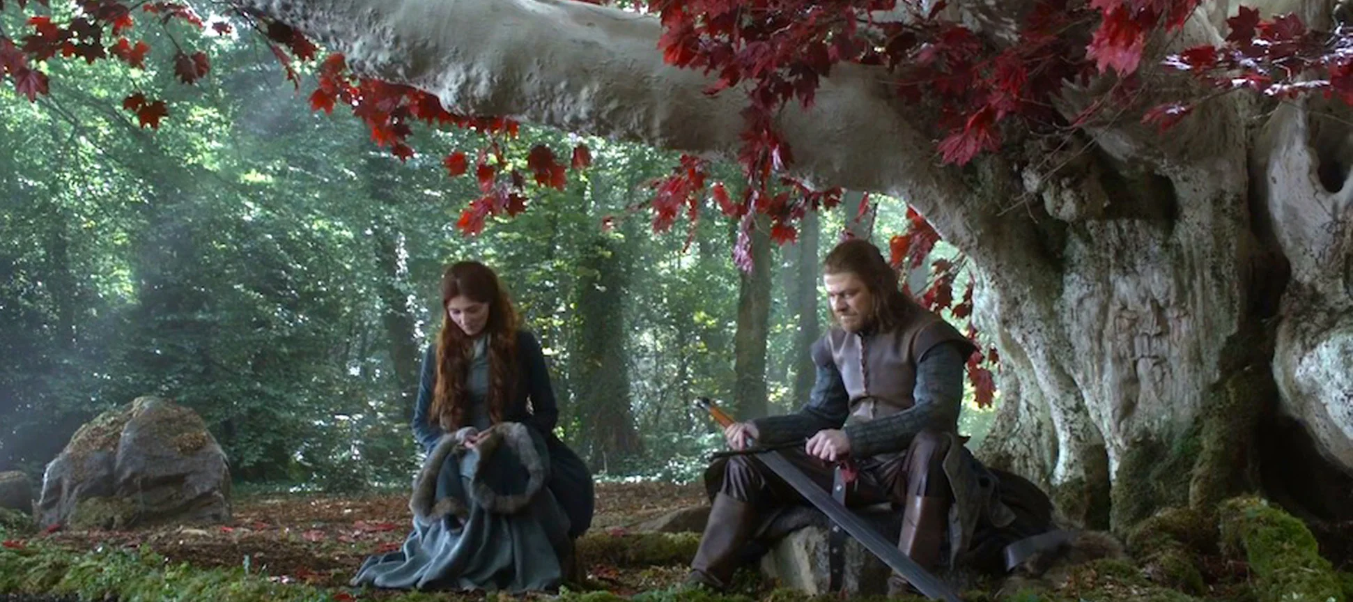
Trees: Not Scary
The Starks' internal design exploration resulted in crude sketches of a tree with red leaves. In the spirit of collaboration, we offered to put the tree into research. The findings: 0% of enemies are afraid of trees while 82% of enemies actually responded with a lot of laughter.


A True Symbol of the North
Several rounds of ethnographies and maxdiff analysis showed a strong correlation between House Stark and wolves. A word cloud exercise unveiled that the mythical direwolves of the North were associated with the words “Big,” “Teeth,” and “Arm Rippers” — all excellent connotations for an emerging brand.
Those findings led to the now iconic Stark heraldry: a grey direwolf sigil on a snow white field representing the North’s long, insufferable winters, and a touch of green to symbolize the hope of spring. (Interestingly, in the North “hope” is also met with a lot of laughter.)

Simplifying the Stark Motto
The Starks approached us with their own suggestion for the house motto: “8000 years of resolute dedication to integrity, honesty, and respect in the vast and challenging expanse of The Great North.” While we expressed appreciation for their efforts, we informed the Starks that their motto was neither simple nor catchy nor good at all. Once tempers cooled and swords were re-sheathed we used vassal house analytics and social listening to develop their now famous motto: “Winter Is Coming.”*
*Interestingly, the runner-up motto was the somewhat sarcastic, “Oh, fantastic. More snow.”

“Westeros Design delivered a holistic brand experience that pays worthy tribute to our northern heritage in a creative way. It’s a testament to their hard work, dedication, and collaborative spirit and I look forward to spending many years strengthening our brand in the North.”
Results
• Brand recognition increased 42%
• Belief in the existence of direwolves increased 82%
• Use of the Stark name in messages sent via raven increased 400%
• While they are very nice, we may never work with The Starks again due to incompatible processes and visions for brand communication. (If any Starks are reading this, remember, you are the good guys and violent retaliation would not fit your brand.)